
Three homepage concepts for the Oxanda Education corporate site
Each concept uses the same facts, photos and brand. Open a concept to review it at full size, then compare the reasoning below each card.
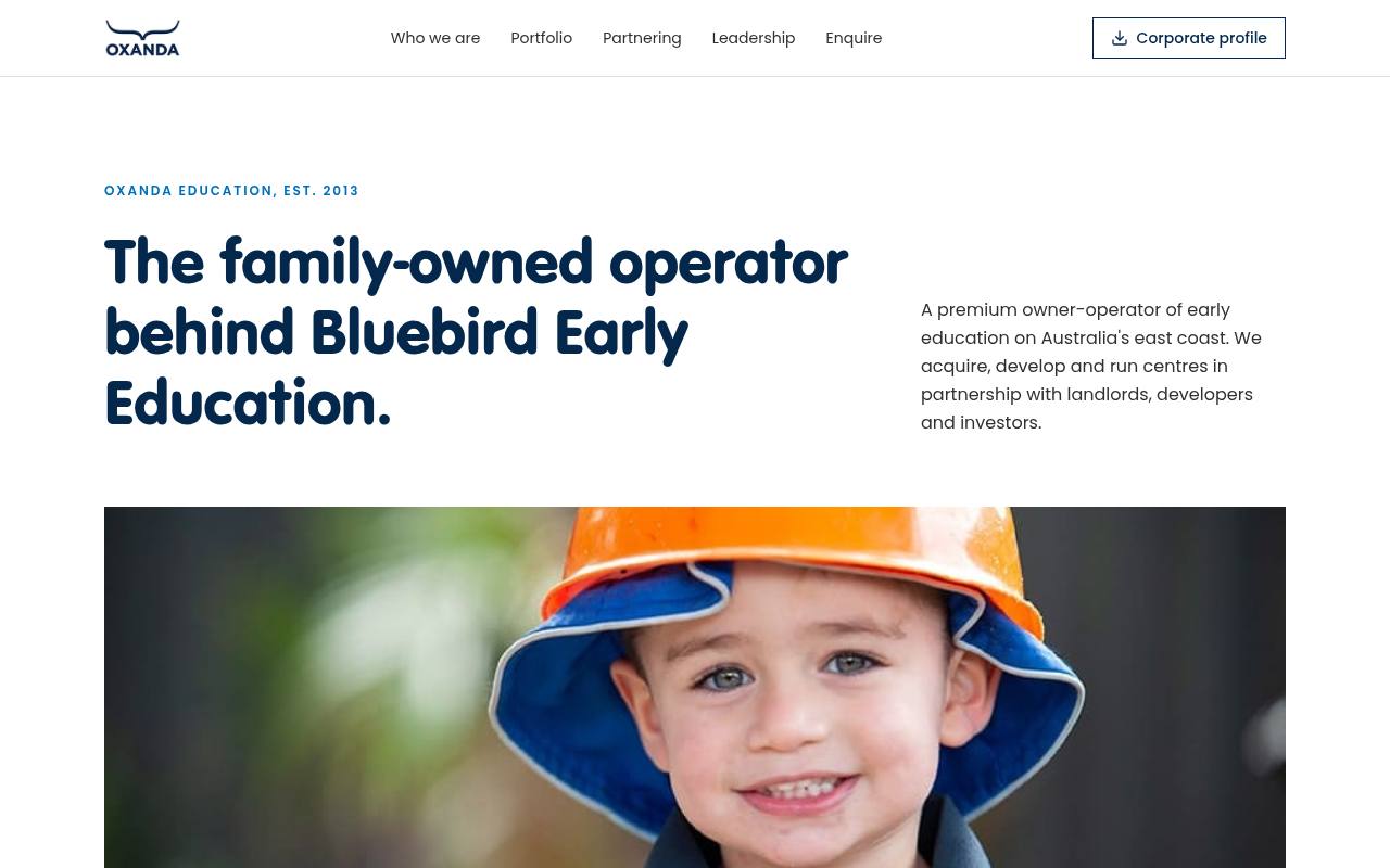
Concept 01
Annual Report
Why this works
- Reads top to bottom like a printed annual report, which is the format investors and funds already trust.
- The key-facts strip puts 2013, 21 centres, 4 opening soon, 3 states and $1m+ in the first screen.
- Numbered sections 01 to 08 make the page easy to reference in a meeting or a call.
- The doodle drawing down the rail is the only motion, so it reads as a signature rather than decoration.
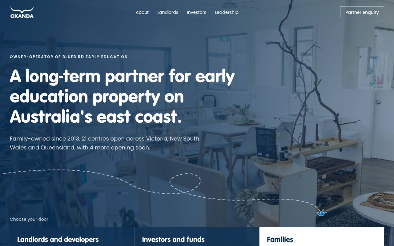
Concept 02
Partner Gateway
Why this works
- Sorts visitors in the hero: landlords and developers, investors and funds, or families.
- Each door opens a section that says what Oxanda offers and what it looks for, including the 5km catchment and demographic test.
- Families are sent to Bluebird in one click, keeping the corporate site focused on partners.
- The bird lands on the Families door once, a quiet link to Bluebird without borrowing its playful style.
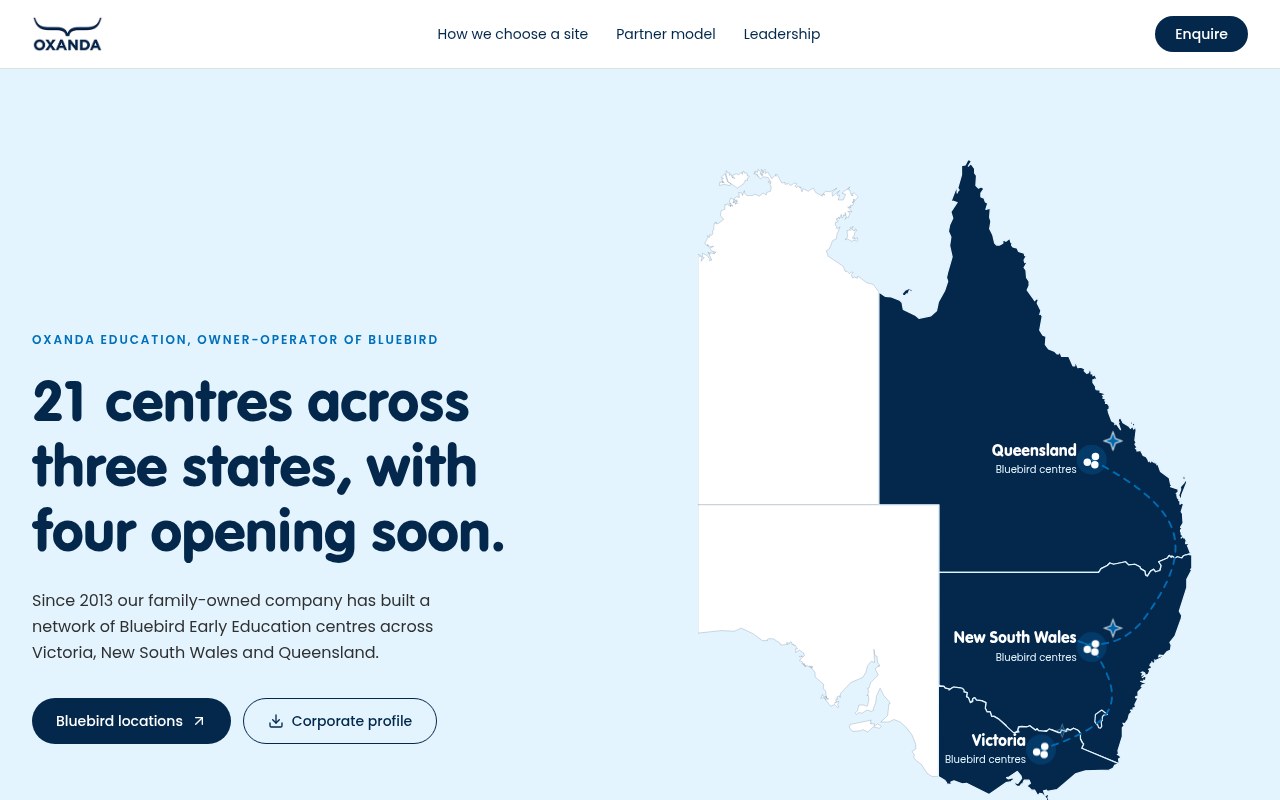
Concept 03
Portfolio Map
Why this works
- Leads with the footprint, the first question a landlord or fund asks: where do you operate?
- Shows VIC, NSW and QLD at state level only, so no locations or counts are implied.
- The five-step site sequence explains how a site becomes an operating Bluebird centre.
- Twinkling stars stand for the 4 centres on the way, joined by the doodle line.